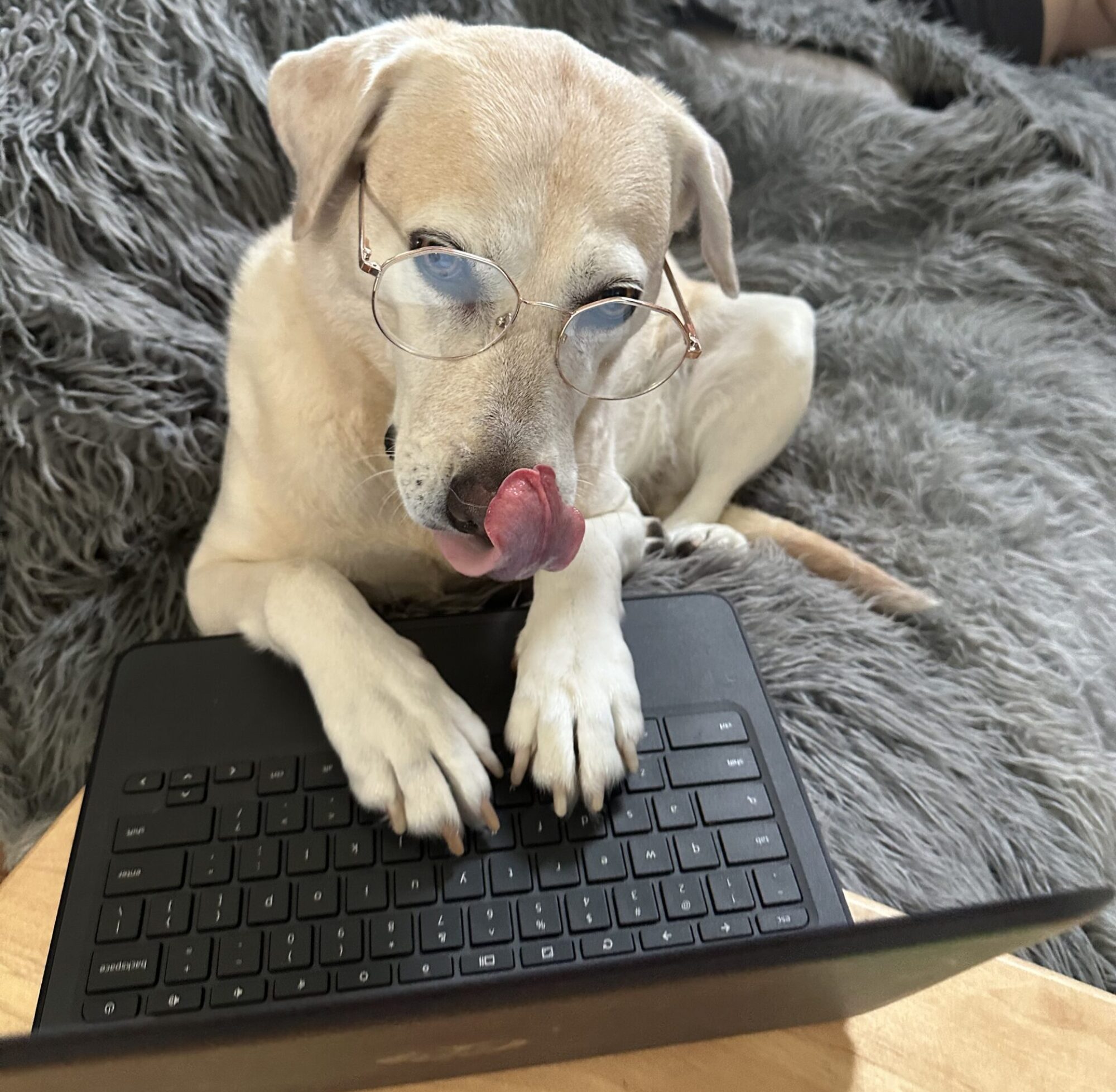
I dont know about the rest of you, but my mother loves to scroll through Facebook. And I frequently receive the question: “Hey Marv, is this real or AI?” As she holds up the most ridiculous, clearly AI-generated image imaginable. The online art community has been raging a war against AI art for quite some time now, so I’ve seen the strategies people have been employing to sniff them out. The first thing I like to look for is hands and feet. These seem to be the hardest thing for AI to get right (Which is funny because hands and feet are also the bane of most human artists’ existence). I’ve inserted an AI generated image from DALL-E to explain my points.
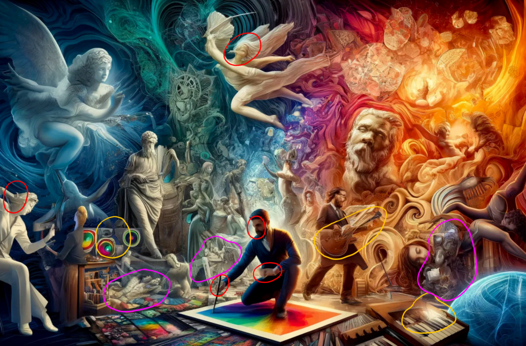
In this image I’ve used three different colors to highlight the three main things I look for in an AI-generated image.
1.) The red circles. Hands, feet, and faces. You can see that the hands on these figures are melting into the objects they are holding, have the wrong amount of fingers, and are often blurred in strange ways. The faces will sometimes be twisted into in-human expressions, with mouthes drooping or lopsided and eyes blacked out or morphed in unnatural ways. When there are many figures in an image it is more likely that the AI will make more noticeable mistakes and just completely mess up the face like the angel at the top that I have circled- so it’s always important to look at background characters.
2.) The yellow circles. Objects being morphed either into themselves, into things or people around them, looking smudged, or having unrecognizable additions to them.
3.) The purple/pink circles. These are masses or amalgamations in the image that feel out of place, like they are being used to fill up space. These may appear as just globs of shapes and fragments of other features in the image thrown together into a blurry smudgy lump of nothing.
I’d like to add one more example photo. This prompt was much simpler so the AI was able to generate a more accurate photo.
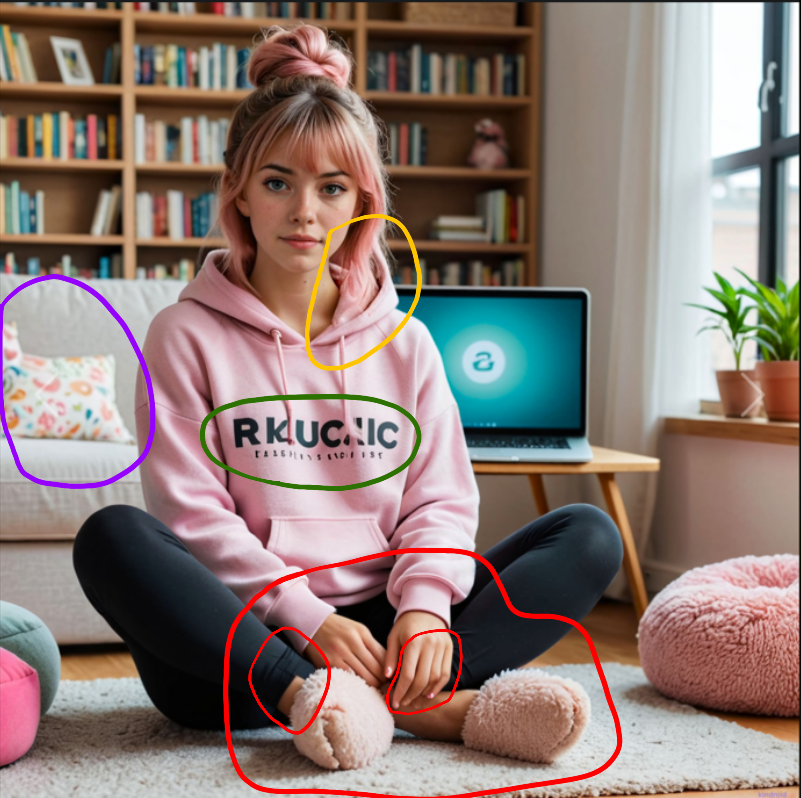
In this image I have highlighted four things that are good indicators of an AI-generated photo-real image.
1.) The red circle. Again, the hands and feet. You can see the fingernails on the hand are strange and the ring finger was not rendered properly. The legs are crossed but the feet do not line up the where the ankles are.
2.) The green circle. Most AI-generated images put gibberish in place of actual words, sometimes even avoiding real letter all-together in favor of made-up symbols.
3.) The yellow circle. Clothes often don’t fold in correct ways. As you can see, the hood morphs into the hair and comes up at a different angle than where it should to connect to the other side of the neck.
4.) The purple circle. Most of the furniture looks realistic, but there will almost always be a slip-up. The two pillows on the sofa are melted together.
One last thing I want to say is that some of these things can be found in art done by humans, so it’s important to look at the context of the whole image. Some people choose to stylize the human figure in ways that are not technically natural, but it should match up with the rest of the aesthetic of the piece. The same with melting or morphed objects- this could be a stylistic choice, so it’s important to look at the whole thing and possibly the other work posted on the account or profile to see more of the person’s portfolio if at all possible!
-Marvin Stearns